A Complete Guide to Choosing Ribbons and Rosettes for Competitions for Event Organizers
Learn how to professionally choose ribbons, rosettes, flo, and flots for competitions. Discover technical tips to create harmonious and eye-catching color palettes for horse ribbons and competition rosettes.
How to Technically Choose Colors for Ribbons and Rosettes? A Complete Guide for Stables and Competition Organizers
Choosing colors for ribbons, rosettes, flo, and flots for competitions is more than just aesthetics. Colors can highlight the importance of an event, strengthen a stable’s identity, and even affect how decorations and awards look in photos. While color selection can be intuitive, there are specific technical methods that help create a harmonious, elegant, and well-thought-out design for rosettes used in competitions and events.
In this guide, we’ll walk you through practical and universal principles of color composition, providing examples and tips based on the color palette available at Flotylion.com.
 1. Choosing Colors Using the Contrast Method – The Ideal Way to Make a Ribbon Stand Out
Contrast is the simplest and most effective method of combining colors in ribbons, flo, rosettes, or flots for competitions. It involves pairing colors with a strong difference: light vs. dark, warm vs. cool, or neutral vs. vibrant.
Examples of contrasts from the Flotylion.pl palette:
-
navy blue + light gold (elegant with a distinct shine)
-
black + silver (classic and easily visible from a distance)
-
dark green + white (highly noticeable contrast)
-
burgundy + gold (prestigious effect)
-
teal + yellow (modern, striking combination)
-
blue + red (warm vs. cool contrast)
Contrast works best for horse ribbons intended for official or high-level competitions, where colors need to be visible from afar and look great in photographs.
2. The Color Harmony Method – Perfect for Elegant Competition Rosettes
The harmony method involves combining colors with similar tones or temperatures. This approach creates a calmer, more classic look, ideal for ribbons, flo, rosettes, and flots for competitions that need to convey elegance and cohesion.
Most Popular Harmonious Color Sets:
-
green + dark green + olive — a calm, traditional palette suitable for outdoor competitions, Hubertus events, etc.
-
burgundy + red + copper — warm, elegant tones with a subtle shine.
-
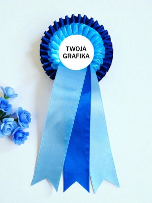
navy blue + blue + sky blue — cool, stylish, and highly cohesive, perfect for formal sporting events.
-
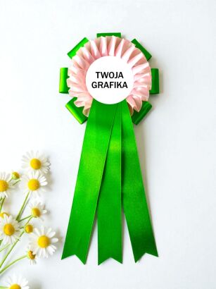
pink + powder pink + fuchsia — delicate yet visually striking palette.
The harmony method works exceptionally well for competition rosettes, where elegance and visual consistency are important, and decorations need to complement elements like sponsor banners, stable colors, or event branding.
3. Accent Color Method – One Bold Color on a Neutral Background
Technically, this method involves combining neutral colors with a single bold accent. It’s ideal when you want a ribbon, flo, rosette, or flots for competitions to look elegant while still having character.
Best neutral backgrounds:
-
white
-
black
-
beige
-
light gold
-
silver
Effective accent colors include:
-
fuchsia (a strong standout)
-
orange (energetic and eye-catching)
-
yellow (great for photos)
-
red (classic in sports)
This method is particularly useful for flots for competitions, as it helps highlight the rank of a category or emphasize a sponsored prize.
4. Color Temperature Method – Warm and Cool Colors in Ribbons
When choosing colors for ribbons, flo, rosettes, or flots for competitions, it’s important to understand color temperature:
Warm colors:
yellow, orange, red, burgundy, brown, copper, gold
→ add energy, create a dynamic look, and work well for fun, show, or youth-oriented competitions and decorations.
Cool colors:
navy blue, blue, teal, sky blue, green, olive, mint, light green
→ give an impression of elegance, calmness, and professionalism — perfect for prestigious events.
Neutral colors:
white, black, beige, silver, light gold
→ can be combined with any other color, making them an excellent base for designs.
Skillful use of color temperature allows you to determine whether a ribbon, flo, or rosette should appear serious and elegant or cheerful and youthful.
5. Choosing Colors for Hobby Horse Ribbons – Color Mix Instead of Composition
A technical note for Hobby Horse ribbons: these products usually have only a single layer, so standard multi-layer composition rules (like contrast) don’t apply here.
Instead, you can use another approach:
Color mix instead of composition
For Hobby Horse ribbons, the following work very well:
-
sets of several ribbons in different colors
-
full series in bright, lively shades
-
combining intense warm and cool colors
Children tend to prefer:
-
fuchsia
-
pink
-
light purple
-
mint
-
yellow
-
sky blue
That’s why floo for horses Hobby Horse look best in cheerful, vibrant colors, where the variety itself creates a visually appealing effect.
6. Environment Matching Method – Stable Colors, Logos, Decorations
This is one of the most practical techniques: ribbons or rosettes for competitions should match the environment where they will be awarded and photographed.
They are most often coordinated with:
-
the colors of the stable organizing the competition
-
sponsor logos and branding
-
course decorations
-
the colors of saddle pads and horse blankets during award ceremonies
Example: if a stable uses navy blue and gold colors, a navy ribbon with silver or gold accents will work perfectly.
7. Photo Visibility Method – One of the Most Important in Equestrian Sport
During award ceremonies, the most important factor is… photography. Colors must be:
-
clearly visible from a distance
-
readable against the rider and horse
-
resistant to both sunlight and artificial light
Best “photogenic” colors:
-
gold, light gold, silver (catch the light beautifully)
-
red and burgundy (stand out against most saddle pads)
-
blue and navy (clear and professional)
-
green and dark green (natural, do not blend into the background)
This method is particularly important for horse ribbons used in regional and national competitions, where photographs serve as promotion for the stables.
Summary
Choosing colors for ribbons, rosettes, flo, floo for horses, and flots for competitions can be guided by simple and effective principles:
-
Contrast — when you want to highlight rank, visibility, and impact
-
Harmony — when elegance and visual cohesion are important
-
Accent color — when you need a single bold element
-
Color temperature — to match the style: energetic vs. professional
-
Environment matching — stable colors, logos, and decorations
-
Photo visibility — absolutely crucial in competitions
-
Color mix for Hobby Horse — where fun and variety matter more than multi-layer composition
By applying these technical methods, you can easily adjust the color schemes of ribbons to suit the event type, participant group, and the visual style of your stable or competition organizer.


 Polish